Pages

Showing posts with label Excel Help. Show all posts

Wednesday, December 7, 2011

Custom Auto Fill in Excel


Custom auto fill is a function used to auto fill custom text, name, number etc.. It is particularly useful when you have to type the same text again and again which is very irritating. This trick will help you save time and make you more efficient at work.

Here is what we are going to do today.
  1. Look at the basic auto fill function in excel.
  2. Creating custom list of auto fill in excel (i.e. user defined auto fill).
Basic Auto Fill Function
This example will give you an idea of auto fill function.
  1.  Type "1" in cell A1.
  2.  Press Ctrl + Enter on keyboard.
  3.  Move your mouse pointer to the bottom right corner of the handler till it changes into a black " + "sign.
  4.  Hold Ctrl and then click and drag downwards. You will notice that the column is filled with ascending    number.


In a similar way you can auto fill name of months and days.The only thing you have to remember in case of months and is that you don't need to hold control. Simply type the first month and drag along the direction in which you want months to appear. You can either drag horizontally of vertically depending on your requirement. It works in both the directions.


This function is particularly useful in case of formulas. Suppose you have formula in C1 for adding values in column A and column B. See image below for description.

Type in the formula "=A1+B1" in cell C1.
Press Ctrl + Enter on the keyboard.
Move your pointer to bottom right corner till it turns into plus sign and then click and drag to fill the sum of column A and column B.

Custom Auto Fill Function.
To make custom auto fill possible, we must first define the custom fill i.e what we want to fill. Instruction to do this is below.
Click on Office button at the top of excel 2007 sheet.
Click Excel option at the bottom right corner of the office button window.
Click Popular.


Click on Edit Custom Lists... button
Type the custom list in List entries separated by comma.
Click Add and then OK.


Now go to excel sheet and type India and then click and drag. The columns or rows will auto fill with the custom values we just created. Your comments will be greatly appreciated to improve these tutorials. 

Friday, December 2, 2011

Combo Box Dynamic Charting in Excel


In this excel 2007 tutorial I am going to show you how to create a drop down combo box to chart source data. We will create a drop down box in excel, which will show the name of the cities in the drop down list. On selecting a city in the drop down list, it will automatically create and display sales data in the form of chart in excel. So let's get started.

Create Sample Source Data.
Open excel 2007 and make a table similar to this.


Create Drop Down Combo box.
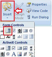
1. Go to  Developer  tab.
2. Click " Insert " in Controls
3. Select " Combo Box " in Form Control.

4.Hold down "Alt " and drag towards right to fill cell " H2 " completely.

Format Control for Combo Box
1. Right click on combo box and select "Format Control".

2. Select City Names in Input range in format object dialogue box.
3. Click " Cell link " and select cell " G1 ".
4. Click OK.


Checking Combo Box
1. Click on black triangle on combo box.
2. Select any city from drop down box.


Creating Chart with Source Data
1. Click " A10 " and type " =INDEX(A3:A6, $G$1) "and hit Enter.

The city you selected earlier from drop down box will appear in cell A10.

2. Again click A10.
3. Click on the bottom right corner of the cell and drag horizontally to auto fill all the months in row 10.
4. Click A9, hold shift on keyboard and then click on cell F10 to select all the data for charting.


5. Go to Insert > Charts > Column and Select Clustered Cylinder chart.
6. Click on chart and Move it Just below the combo box. 


Now try changing city from the drop down box and you will observe that it charts data for a particular city selected from the drop down box. Comments regarding improving the tutorials will be highly appreciated.

Referred Links
Combo Box Animation (Flash Lite Tutorial)

Sunday, November 27, 2011

Comparison Charts With Excel


Today we are going to learn how to make a chart which compares two or more data in a table. It is very useful when we want to compare between two values very easily within no time. As you will agree that comparing data with a graph is far more better than digging into a lot of data in a table. So lets get started. this is what we are going to create.

Follow these easy step by step method to create the chart as in the above image. Lets say we want to compare a list of items A to E for number of units in stock, purchased and sold.
Step 1
Create a sample data as below.

Step 2
Go to Insert > Charts > Column and then select Clustered Column chart from 2D Column.


Step 3
Select Layout 5 from Chart Layouts in Chart tools in Design tab.


Step 4
Right click on chart area and click on Select Data.

Step 5
In the Select Data source window click on Add.


Select the title "In Stock" for Series Name and Data below In Stock title for Series Values and click OK.


Notice a series In Stock is added in the Legend Entries (Series) list box. Now click on Edit button.


Select Item names A to E for Axis label range and click OK.


Similarly Add Two more series Purchased and Sold  as illustrated above for Purchase and Sold units.

Step 6
After completing above five steps you should get a graph as shown in the image.


Right click on Axis Title and choose Edit Text. Delete the text and write "Number of Units". Select the text and change the font size to 12 and the result is. . . 


Leave me a comment if you like this post.

Friday, November 25, 2011

Dynamic Chart


Today we are going to make our charts dynamic in nature. By dynamic I mean that the chart will update automatically on adding new data to the table. As I always say, just follow these simple steps to make your charts update as you enter new data. You can use this tutorial to create resource chart also.

Step1:- First of all open excel  and create sample data as in the image below.


 Step 2:- Go to Formula tab in excel and click on Define Names. A pop-up window opens up.


              In Name write "Day".
              In Refer to write " =OFFSET(Sheet1!$A$2,0,0,COUNTA(Sheet1!$A:$A)-1)".
              Click OK.

              Again click on Define Names.
              In Name write "Resource".
              In Refer to write "=OFFSET(Sheet1!$B$2,0,0,COUNTA(Sheet1!$B:$B)-1)".
              Now save your book. I saved it as "Dynamic.xls".

Step 3:- Now go to Insert > Charts > Column Chart and select Clustered ColumnType

 
Step 4:-  Go to Chart Layouts and Select Layout 8 from the layouts.  


Step 5:- Create the chart as in my previous tutorial Create a Simple Chart in Excel.
              While Selecting data do follow these steps


              In the series values write "=Dynamic.xls!Resoures". 
              Remember to replace Dynamic.xls with your own file name.


              In the Axis Label Range write "=Dynamic.xls!Day"
Note:- Confusion regarding file extension as pointed out by my friend.
For Excel 2003 "Your_File_Name.xls".
For Excel 2007 "Your_File_Name.xlsx".
Above example is as per 2003 format. 

Step 6:- Change Chart style to Style 16 and it should look like this.


Now try adding new data to your table, you will notice that it automatically updates in your graph. Leave a comment if it works.

Referred Links
Dynamic Charts (Peltier Tech Blog)


Wednesday, November 23, 2011

Add Data Labels to Excel Charts


Last time we created a simple stacked column charts in 6 easy steps. Today I am going to teach you how to add data labels to your charts. This is what we are trying to achieve.


Earlier you learned how to create simple stacked column chart. Now to Add Data Labels to the chart follow these simple steps.
Step 1:- Open the chart which you have prepared. Now right click on the chart and click on Add Data Labels.

Now your chart should appear like the image at the bottom.


Step 2:- Again Right Click on the chart and then Click on Format Data Labels. A pop-up window will appear. In the pop-up window choose Label Option and check Value and Series Name check box and also click on the Inside Base radio button.

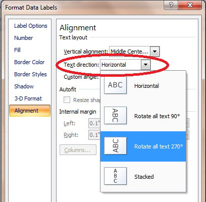
Now choose Alignment in the Format Data Labels Options, then from the drop down list of Text direction choose Rotate all text 270 degree.


There you go. You just added data labels to your chart and the final result is this.


HostGator Promos